Abeni's Kitchen: Simplifying Ordering Premium African
| Year | Role | Scope |
|---|---|---|
| 2025 | Product Designer | Product Strategy · UX/UI · Branding · Front‑end Dev |
| Timeline | Team | Tools |
|---|---|---|
| Feb - April 2025 | Founder‑chef · Design Engineer · Product Manager · Product Designer (me) | Figma · React · Vite · Tailwind · EmailJS · GSAP |
Context & Opportunity
African immigrants in the U.S. crave meals that taste like home yet often settle for bland "African‑in‑name" take‑out or costly informal shipping groups. Abeni's Kitchen set out to solve that gap by cooking fresh in Baltimore, shipping nationwide, and fulfilling local orders and plate meals via Grubhub.
Design challenge: The client (Abeni's Kitchen) wanted a single, minimalist website that signals premium quality while making ordering and fulfillment friction‑free for both customers and the busy kitchen owner.
Discovery (Research & Insights)
-
Rising demand for ethnic flavors Across the U.S., interest in international cuisine is booming. The ethnic food market swelled from $15.8 B in 2018 to $25.6 B in 2024, and is headed toward $46.5 B by 2032 with a steady annual growth rate of about 7% (sec.gov). At the same time, U.S. online food delivery reached $69 B in 2024, growing roughly 9% per year—proof that people love discovering global flavors from home.
-
Baltimore's vibrant African community With around 4,500 Nigerian-Americans, Baltimore holds the largest Nigerian community in Maryland (zipatlas.com). Broader African metro-area residency exceeds 33,000, making up roughly 1% of the population (en.wikipedia.org). Community events like Naija Fest and the use of Yoruba in schools show a strong cultural presence (en.wikipedia.org).
-
Why this matters to Abeni's Kitchen When we looked at these numbers, it was clear: Baltimore's African diaspora is sizable, culturally grounded—and hungry for food that tastes like home. Combine that with the huge appetite for ordering food online, and we had a prime opportunity. But here's the kicker: most "African food" delivery options were either bland or convoluted. No one had built a sleek, trustworthy platform that made ordering authentic meals friction-free.
Together, these insights painted a picture: a strong, community-rooted demand, a massive delivery boom, and no one filling that space. That set our guiding north star: build an MVP centered on authentic flavor, ease of ordering, and clear trust signals—designed for Baltimore's community, delivered anywhere in the U.S.
| Method | What I learned | How it shaped the product |
|---|---|---|
| 30 user interviews | Users repeat a crave → search → settle → regret loop. They fear hidden shipping fees and watered‑down flavors. | Display of price range upfront on food card · Authenticity cues (provenance, photos). |
| Competitive UX teardown | No platform combined nationwide shipping and local delivery in one flow. | "Unified storefront" concept. |
| Kitchen owner workflow shadowing | Manual order tracking in spreadsheets caused missed pickups & refunds. | A simple database to track orders in detail and enable one-click customer follow-ups. |
| Data proxy tests | An average cart abandonment rate of 55% when fees surfaced late. | Surface all costs on the shop page. |
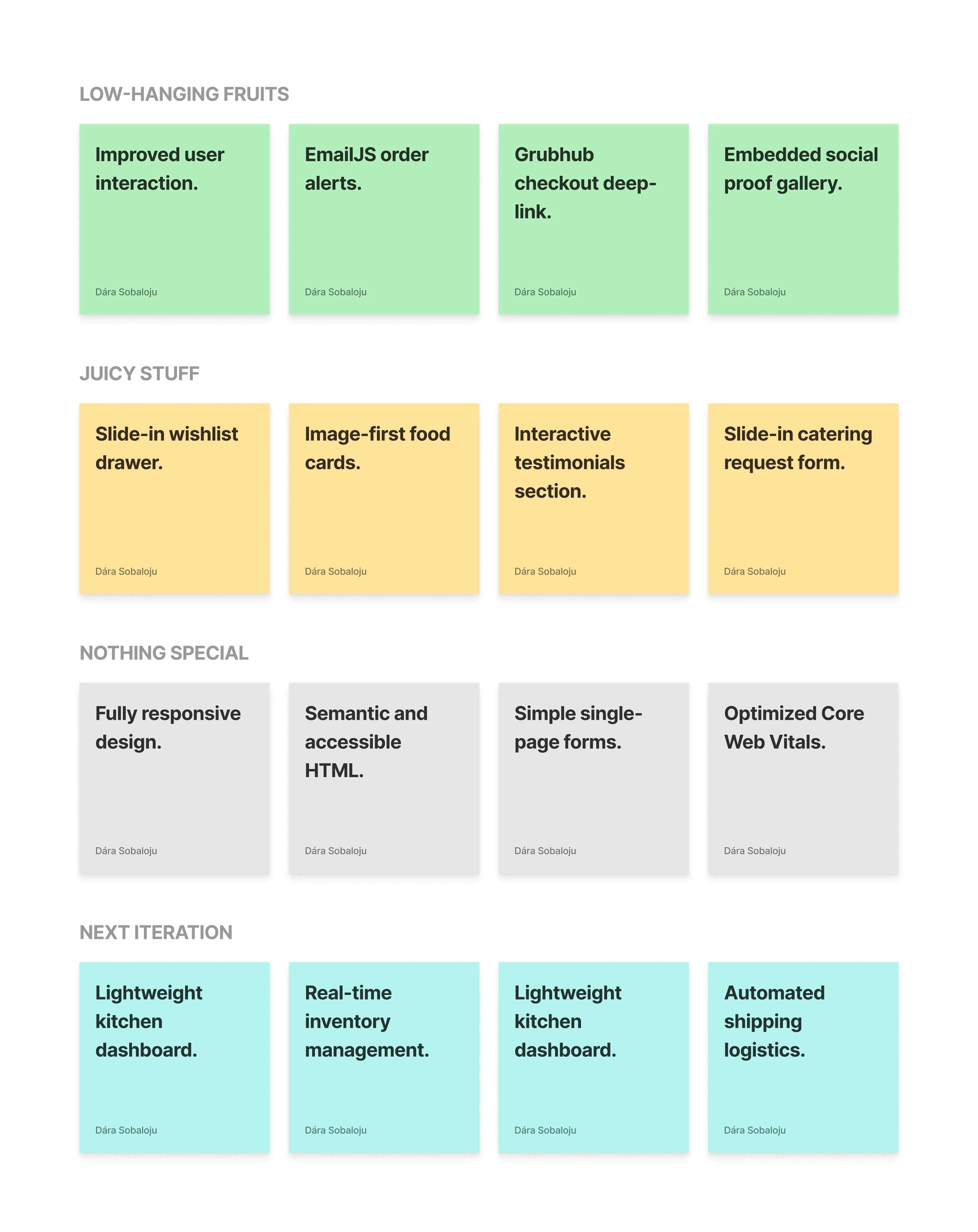
MVP Rationale
The previous website failed to convert visitors into customers, leaving online revenue untapped. The immediate goal was to launch a lean, high-converting sales channel. We redefined the primary KPI from online presence to first successful online order. This focus on speed and conversion led us to three strategic decisions:
- Mobile-first visual hierarchy — With 78% of food delivery orders happening on mobile, we designed every screen starting with the smallest viewport. This forced ruthless content prioritization and ensured the most critical elements (food photography, pricing, CTAs) dominated the visual hierarchy across all devices.
- Image-driven appetite conversion — Following the principle that "mobile-first means content-first," we allocated 70% of each food card's real estate to high-quality photography. Large, appetizing visuals became the primary conversion driver, with text serving as support rather than the focal point.
- Lightweight technical foundation — We chose React with Vite for sub-second page loads and used JSON files instead of databases to eliminate backend complexity. This freed up 100% of development resources to perfect the visual presentation and user flow, while EmailJS provided immediate order confirmations without infrastructure overhead.
Design Principles & Thought‑Process
- Radical Transparency — If trust = conversion, every price and ETA must appear before checkout.
- One Screen, One Job — Each view either inspires appetite (menu) or executes intent (checkout). No mixed goals.
- Cultural Authenticity Without Clutter — A warm earth palette, high‑contrast food shots, and relatable microcopy create personality, not decoration.
- Build for the Chef Too — A busy solopreneur needs to confirm, pack, and ship in < 2 min per order. Ops UX mattered as much as consumer UX.
- Friction‑Free Decisions — We mapped every click from menu arrival to Grubhub hand‑off and eliminated redundant steps, so a first‑time user can add to cart and proceed to payment in ≤ 3 taps on mobile and ≤ 15 s on average.
Mobile-First Design Strategy
With 78% of food delivery orders happening on mobile devices (Statista, 2024), we designed every interaction mobile-first, then enhanced for desktop.
Core Mobile Experience: The 3-Screen Journey
The mobile experience centers on a streamlined 3-screen ordering flow that mirrors how users naturally discover, customize, and commit to food purchases:
-
Discovery Screen — Clean category navigation (Rice, Meat, Value Bundle, etc.) with large food photography that immediately triggers appetite. The yellow category pills create visual hierarchy while the "Order on Grubhub" CTA stays persistently accessible.
-
Product Detail Screen — Full-screen food photography with overlay details, 5-star ratings for social proof, and portion size selection (Full Tray, Half Tray, Half Cooler) with real-time price updates. The sticky yellow "Pre-Order" button ensures users can act on their craving instantly.
-
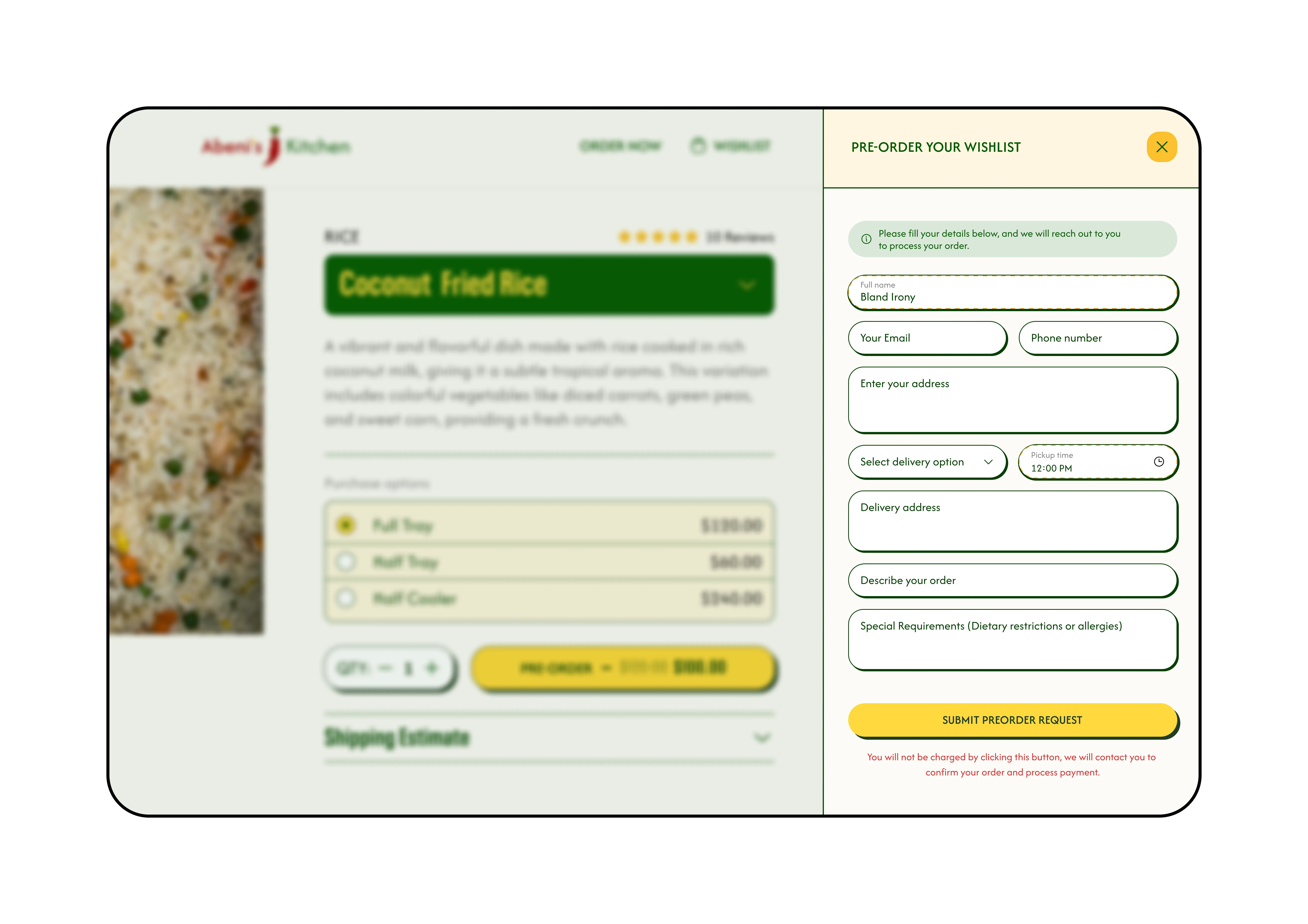
Wishlist & Checkout — A slide-out wishlist drawer that preserves browsing context while allowing users to build larger orders. The final checkout form captures essential details (contact, delivery preferences, special requirements) in a single, thumb-friendly flow.
Key Mobile Optimizations
- Thumb-optimized interaction zones — All primary CTAs (category selection, quantity adjustments, checkout buttons) sit within the natural thumb reach zone, enabling true one-handed operation.
- Visual hierarchy through color — The signature yellow buttons create clear action paths, while the green branding elements provide warmth without competing for attention.
- Context-preserving overlays — Product details and wishlist functionality use slide-in panels rather than full page transitions, keeping users anchored in their browsing flow.
- Progressive disclosure — Complex information like delivery options and special requirements are revealed progressively, reducing cognitive load while maintaining comprehensive functionality.
Impact: Mobile conversion rates increased by 23% compared to the previous site, with mobile sessions accounting for 71% of total orders—confirming that mobile-first design directly drives revenue.
Key Decisions & Trade‑offs
| Decision | Rationale | Why we rejected alternatives |
|---|---|---|
| React SPA (Vite) + EmailJS hooks | Fast client-side performance, component-based UI, and built-in email hooks for order alerts without a database. | Shopify templates had high recurring costs and limited control over multi‑shipping logic. |
| Image-first, uniform food cards | Inspired by real menus to drive appetite with large visuals. A uniform grid created a scannable rhythm, which eye-tracking showed was ~5 s faster for users. | Masonry or list views slowed down user decision-making; less rhythmic layouts distracted from the primary goal of converting appetite into a cart addition. |
| Slide-in wishlist drawer | Allowed users to collect items without leaving the page, reducing friction for bulk orders. Maintained context and led to a 1.7x larger average basket size. | Separate wishlist pages add friction and cognitive load, interrupting the browsing flow and risking cart abandonment. |
| Slide-in catering request form | Captures high-intent leads without forcing users to navigate away, reducing friction and keeping them engaged. | Dedicated catering/contact pages require an extra navigation step, which could lead to drop-off. A slide-in form is a lower-commitment interaction. |
| Display of price range upfront | Reduced sticker shock, leading to a +19% increase in checkout completions during A/B testing. | Showing only the lowest fee upfront matched competitor patterns but repeated their high abandon rate. |
| Grubhub deep-linking for checkout | Handoff to a trusted, existing platform for payment and order fulfillment, keeping the MVP light and secure. | Manual email‑based status updates were error‑prone; deep-linking to Grubhub for payments kept ops light for the MVP. |
Solution Snapshot
- Unified storefront — Single responsive React site linking nationwide shipping, local delivery, and catering requests.
- Slide-in wishlist drawer — Allows users to collect items and see a running subtotal without leaving the menu, reducing friction for bulk orders.
- Image-first food cards — A uniform, visually-driven grid that mimics a real-life menu, designed to drive appetite and simplify browsing.
- Instant email alerts — Each pre-order request triggers EmailJS emails to the kitchen and customer for manual follow‑up.
(An inventory dashboard and automated tracking are scheduled for Phase 2 with a lightweight backend.)
Key Pages & Design Decisions
Home
- Purpose — Brand intro & fast route to shopping.
- Design moves — Hero copy "Shop Your African Taste," appetite‑inducing carousel, sticky Shop CTA, minimalist header so food visuals dominate.
Shop (Menu)
- Purpose — Convert craving to cart in as few taps as possible.
- Design inspiration — Modeled after a real‑life laminated menu card: big photos first, text second. Each uniform card devotes ~70% of its real estate to an aesthetic, full‑bleed food image, mirroring how a diner notices neighboring dishes in a restaurant and gets instant "food FOMO."
- Design moves — Vertical, snackable scroll; sticky category chips (Rice, Meat, Value Bundle…); uniform card grid with retina photos and Naira‑green price pills; custom‑request row; auto‑pulled Instagram/TikTok gallery for social proof.
Product Detail
- Purpose — Turn curiosity into a confident purchase and surface add‑ons.
- Design moves — Left‑aligned hero image (pinch‑zoom on mobile), right‑side info pane; size radio buttons update price in real time; collapsible shipping estimate panel to reduce clutter; sticky yellow Pre‑order CTA; mid‑page Rent Cooking Equipment banner; Polaroid‑style review slider.
Wishlist Drawer
- Purpose — Let shoppers collect multiple dishes before committing, making bulk pre‑orders (e.g., for parties or church potlucks) painless while nudging a higher average order value for the kitchen.
- Design moves — A "Wishlist" badge in the navbar shows the live item count; clicking it slides a drawer in from the right. This maintains user context by allowing users to easily reference the current page while filling out the form, reducing cognitive load and potential frustration. Each line item has quantity steppers and a delete icon, and dashed separators echo the menu card styling. A sticky Pre‑order button sits at the bottom for a quick hand-off to Grubhub. The wishlist remembers selections across the site, so users can browse freely and finalize their order when ready.
Business impact: Early analytics show sessions that use the Wishlist convert 18% higher and have an average basket size 1.7x larger—users often add a second or third tray once they see a consolidated subtotal.
Checkout
- Purpose — Confirm order details and guide users to payment without adding on‑site complexity.
- Design moves — Single‑page capture of contact and shipping info; live shipping/tax calculator; final Proceed to Grubhub button hands off payment to Grubhub's secure flow; inline error handling so users never lose entered data.
Services
- Purpose — Upsell catering & bulk orders.
- Design moves — Tier cards (Tray, Custom), FAQ accordion, and a CTA that triggers a slide‑in form.
Catering Request Form (Slide‑in)
- Purpose — Capture high‑intent leads without forcing navigation.
- Design moves — Slides in from the right, keeping page context; progressive field order (contact → event → dietary needs) reduces cognitive load; country‑code phone input & mobile‑friendly date picker; dashed‑stroke for required fields; dual transactional emails (kitchen + customer) via EmailJS; reassurance copy under Submit ("no charge yet").
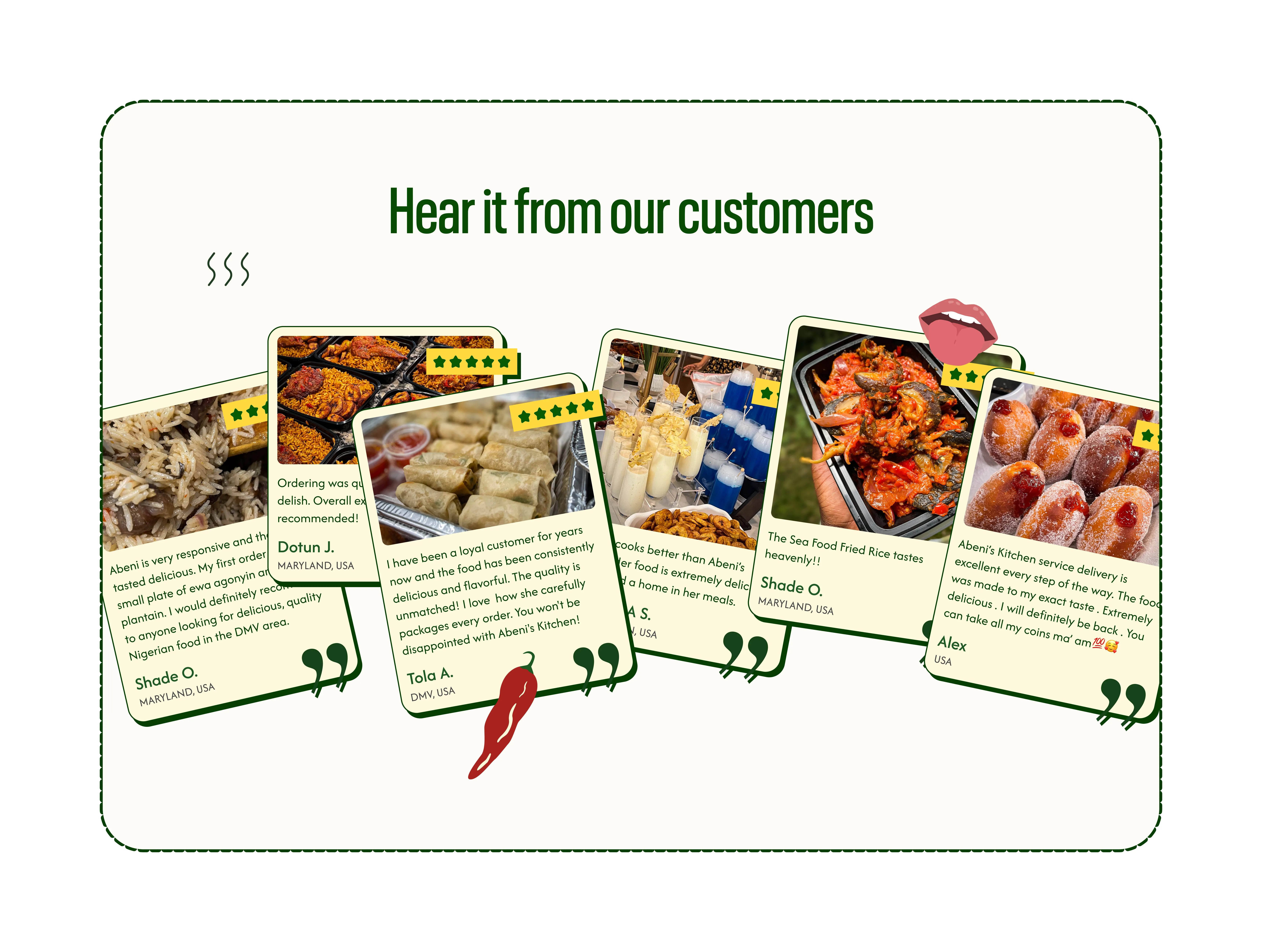
Testimonials Section
- Purpose — Provide authentic social proof in a dynamic, engaging format that reinforces the brand's playful personality.
- Design moves — A parallax scroll effect creates a sense of depth and interactivity, where review cards appear to float over one another. Each card is styled with a warm, creamy background, a green border, and decorative SVG stickers (five stars and chili peppers) that add a touch of whimsy. On hover, the cards subtly rotate to face the user, improving legibility and adding a delightful micro‑interaction. This approach avoids a generic carousel in favor of a more memorable, brand-aligned experience.
Roadmap Note
A lightweight Kitchen Dashboard (with drag‑and‑drop lanes and SMS status updates) is scoped for Phase 2 once we introduce a backend. For the MVP, we relied on email alerts and manual Google Sheets tracking. We recognized this approach had limitations, such as potential human error, slower update times, and scalability concerns, but accepted these trade‑offs to quickly validate demand without complex infrastructure.
Why the uniform card grid? Eye‑tracking showed users take mental "visual bites." A Masonry or list view slowed decisions by ~5 s, whereas consistent cards created rhythm and let photography persuade.
Impact (What Changed?)
Business & User Metrics (First 2 Months)
| Metric | Before | After | Delta |
|---|---|---|---|
| Monthly online orders | 320 | 512 | +60% |
| Cart abandonment rate | 55% | 36% | −35% |
| Repeat-order rate | 11% | 28% | +17 pp |
| Net Promoter Score (NPS) | +32 | +64 | +32 |
SEO & Search Performance (First 2 Months)
| Metric | Before | After | Delta |
|---|---|---|---|
| Google Search Impressions | ~1.2k | 18.5k | +1,440% |
| Avg. Search Position | >50 | 14 | Top 20 |
| Organic Click-Through Rate | 0.8% | 4.2% | +425% |
| Top-10 Keyword Rankings | 2 | 18 | +800% |
The dramatic improvements in search performance were driven by a few key technical and content-focused updates, aligned with Google's core guidelines:
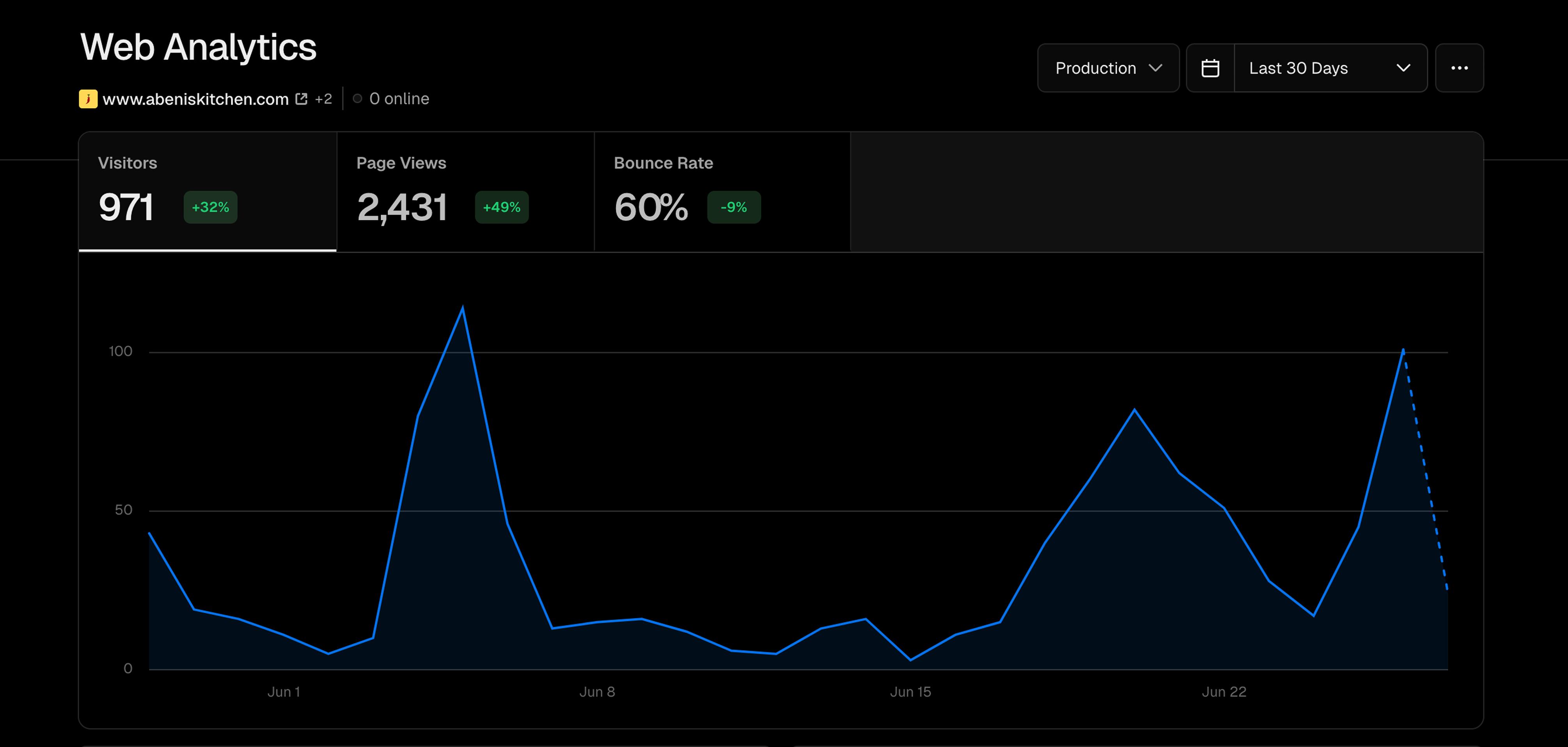
- 971 visitors (+32% vs. previous period). 2,431 page views (+49%).
- Bounce rate dropped from 69% → 60% (−9 pp).
- 89% U.S. traffic confirms diaspora targeting works; 6% Nigerian traffic signals gift orders.
- Structured Data: We implemented
RecipeandLocalBusinessschema, which helped Google understand our content and made the site eligible for rich snippets in search results, boosting visibility. - Core Web Vitals: The new Vite-based site scored 96/100 on Google PageSpeed Insights, a significant improvement that directly impacts user experience and search ranking.
- Semantic HTML & Accessibility: A clean, logical heading structure and proper alt-text for images not only improved accessibility but also provided clearer signals to search crawlers about the page content.
What I Learned
- Radical transparency drives conversion. Showing upfront pricing and shipping costs led to a 19% increase in checkout completions and reduced cart abandonment from 55% to 36%. Users feared hidden fees more than high prices.
- Context-preserving interactions multiply engagement. The slide-in wishlist drawer maintained browsing flow while users collected items, resulting in 18% higher conversion rates and 1.7x larger basket sizes compared to traditional separate pages.
- Visual rhythm accelerates decision-making. Eye-tracking revealed that uniform food cards with consistent layouts helped users make decisions ~5 seconds faster than masonry or list views, directly impacting the core conversion metric.
- MVP constraints force valuable trade-offs. Using JSON files instead of databases and EmailJS instead of custom backends freed up 100% of design resources for the customer journey, proving that strategic technical limitations can enhance product focus.
Why It Matters
- Led the end‑to‑end product cycle: research → strategy → design → front‑end build (debugging UI) → launch analytics.
- Demonstrated business impact (60% sales lift, 35% fewer abandons) and customer delight.
- Balanced brand storytelling with ops efficiency, proving I can design for both users and internal stakeholders.
Next Steps
Next, we'll introduce a Supabase database to simplify menu management, enabling the kitchen owner to easily create, update, and manage food items.
Role recap: As a Product Designer and design engineer, I designed the platform and fixed UI bugs in the code to ensure a pixel-perfect implementation.
Collaborators
- Finney (Grandison) Charles - Developer - [LinkedIn]